01 — Challenge
The work before the win
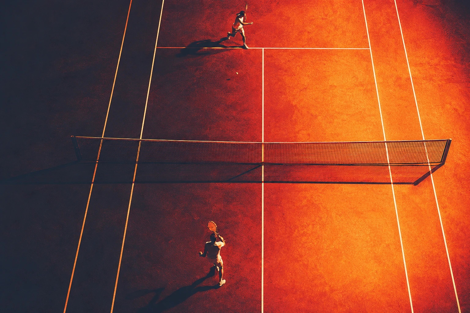
Obsidian is for people who take their shit seriously — before the results, before the recognition, before any of it matters.
The real challenge wasn't making it look premium. It was making it feel earned — built for the ones who lose a set and come back harder, who show up at 5am when nobody is watching, who don't need a brand to motivate them. They just need gear that keeps up.
02 — Strategy
Premium meets culture
Every sports brand was chasing premium. We went the other way.
The culture was broken — motivational noise, generic gear, brands that looked like they were designed for a gym membership poster. Nobody had anything that felt like them.
So we built something around the insecurities, the uncertainty, the rough edges. The kind that holds up under pressure.
Just a brand that respects the athlete enough to shut up and deliver.
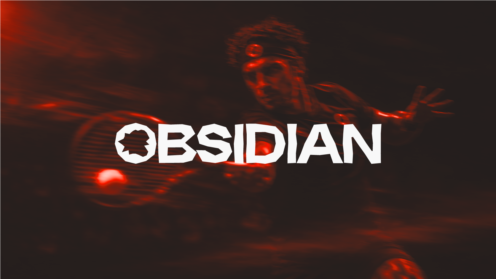
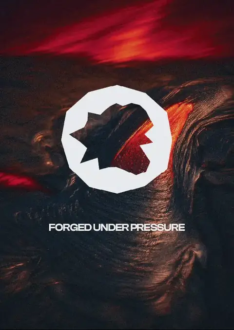
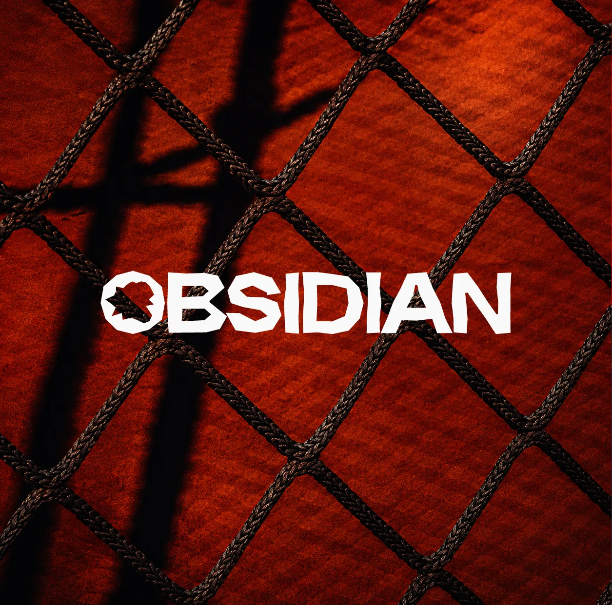
03 — Identity
Naturally sharp
Obsidian looks like glass but cuts like a blade. Smooth on the surface, ruthless underneath. That's what the brand is built on — the tension between refined and raw, calm and intense. No hype. No bullshit. Just pressure, discipline, and the kind of edge that's earned.
The wordmark stays bold and simple because the name already does the talking. The icon draws from fractured obsidian stone — sharp, imperfect, and shaped by pressure. Raw enough to stand out, refined enough to belong.
"The hard way or get the hell out."
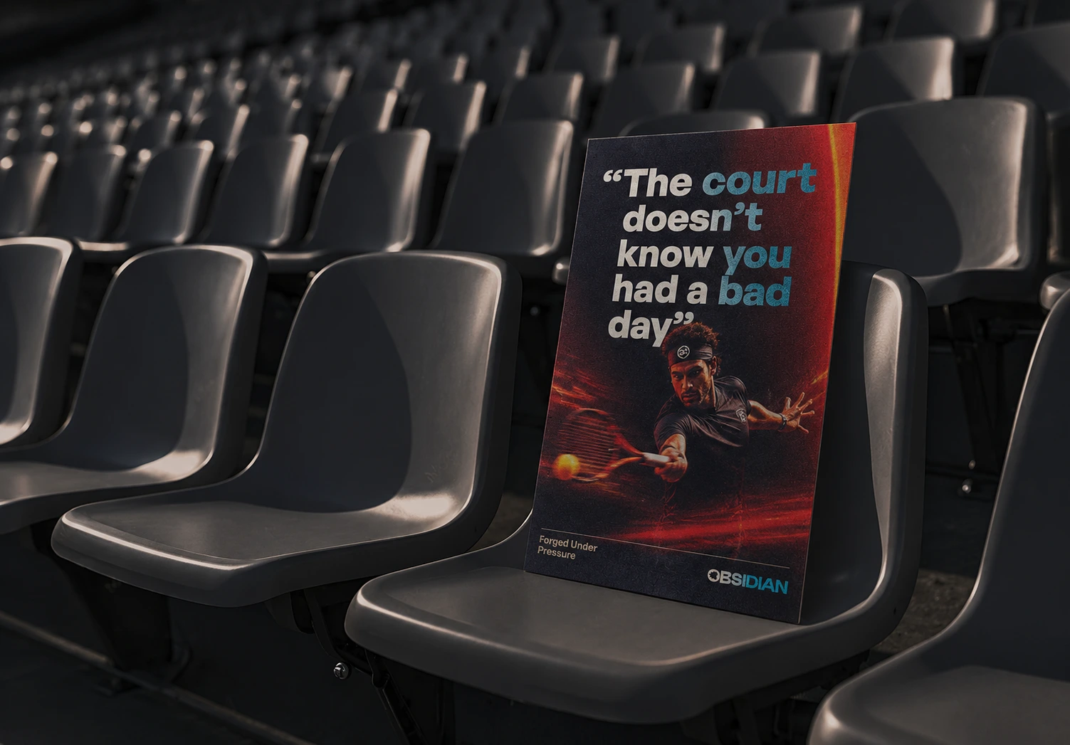
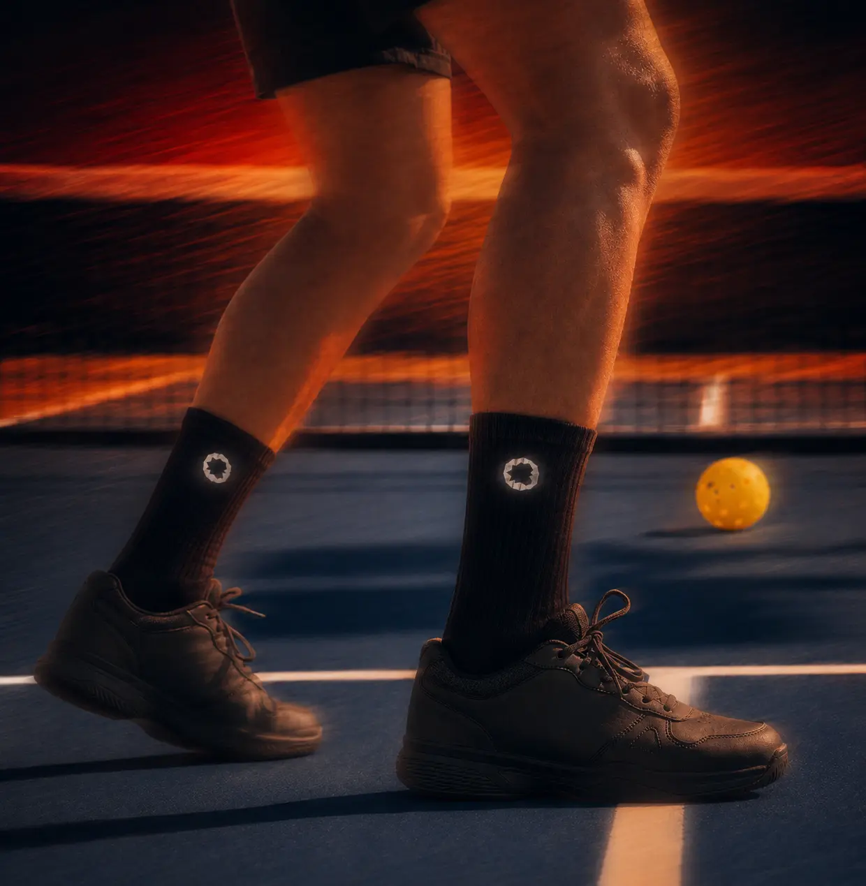
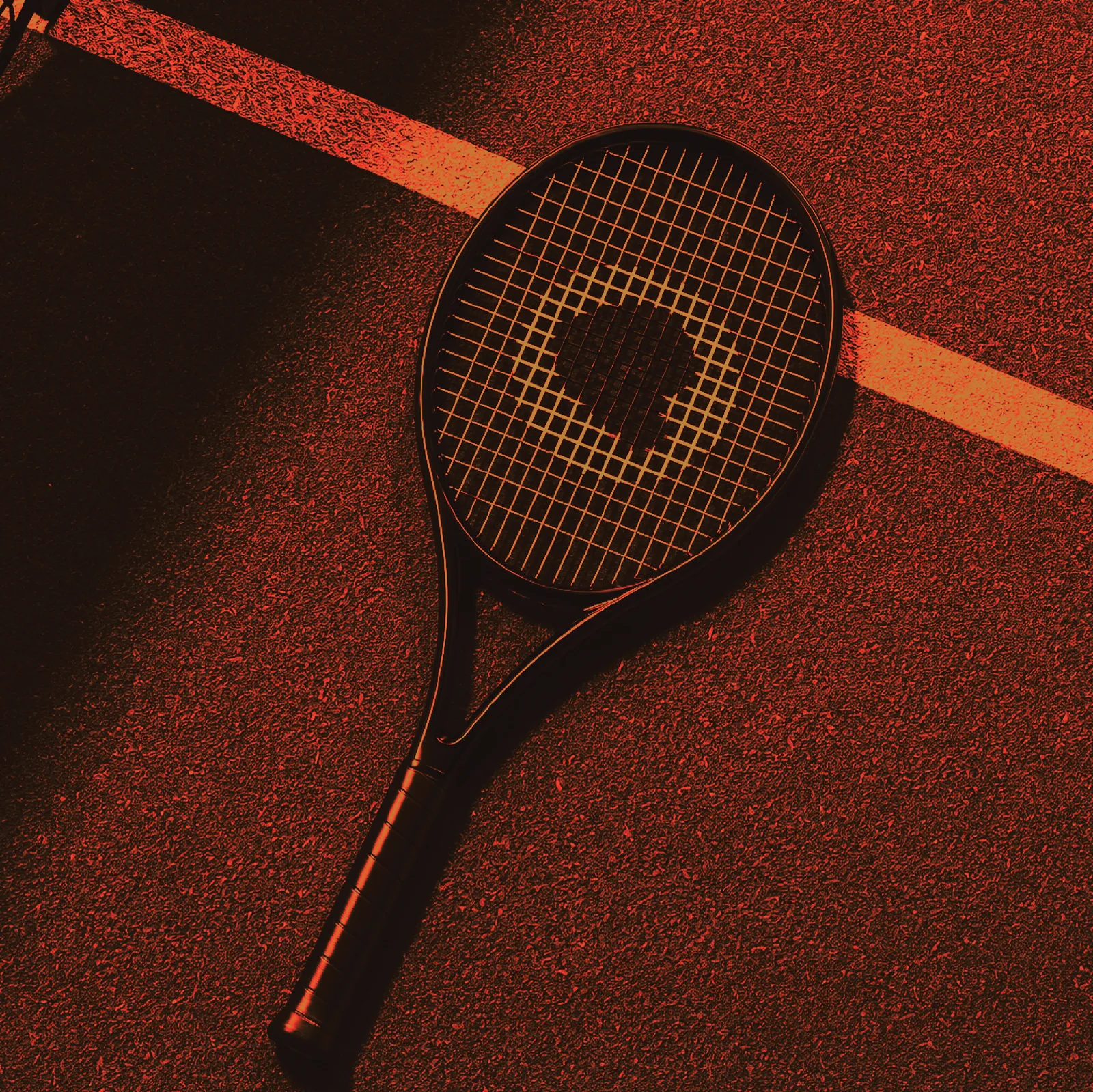
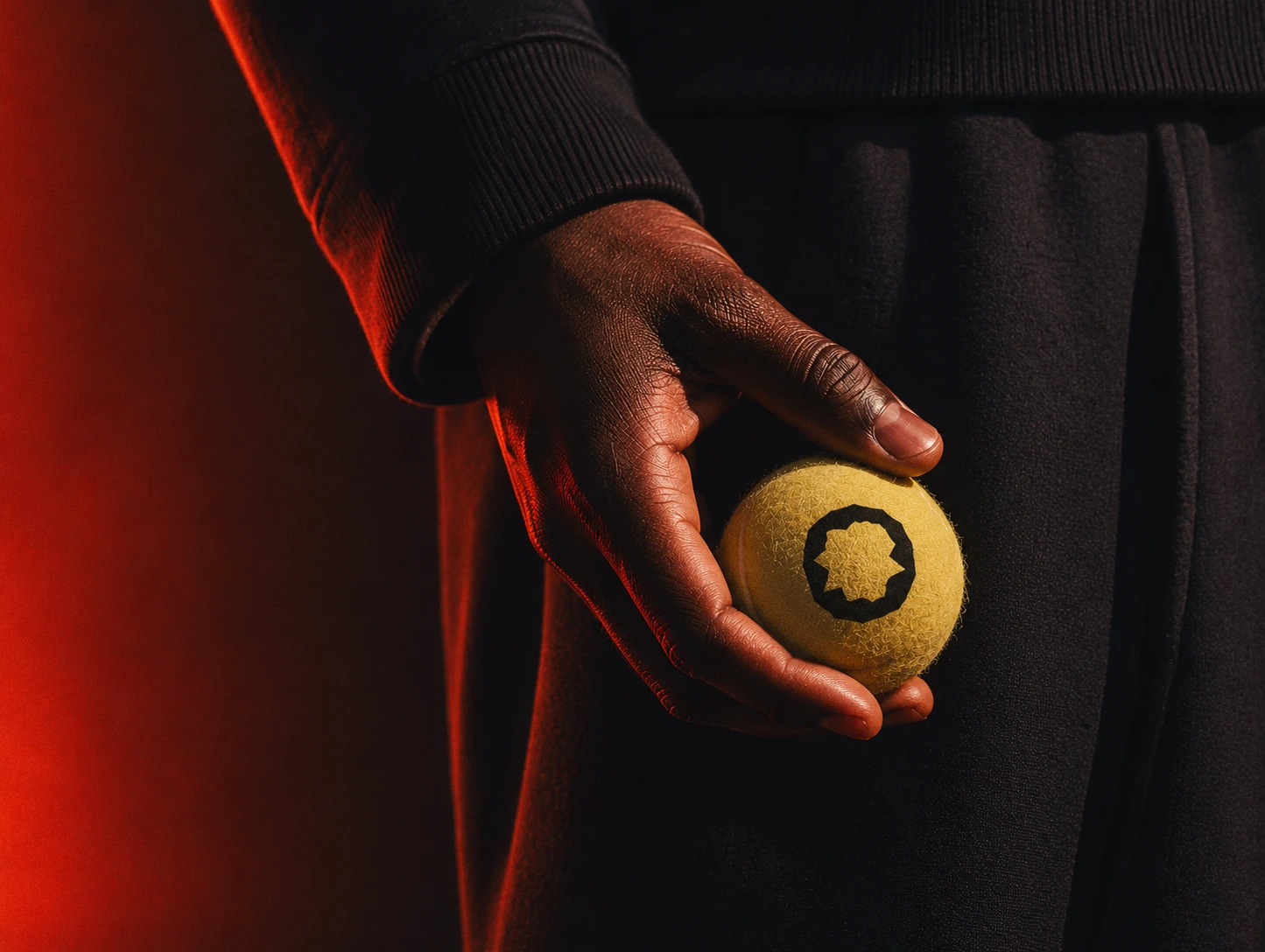
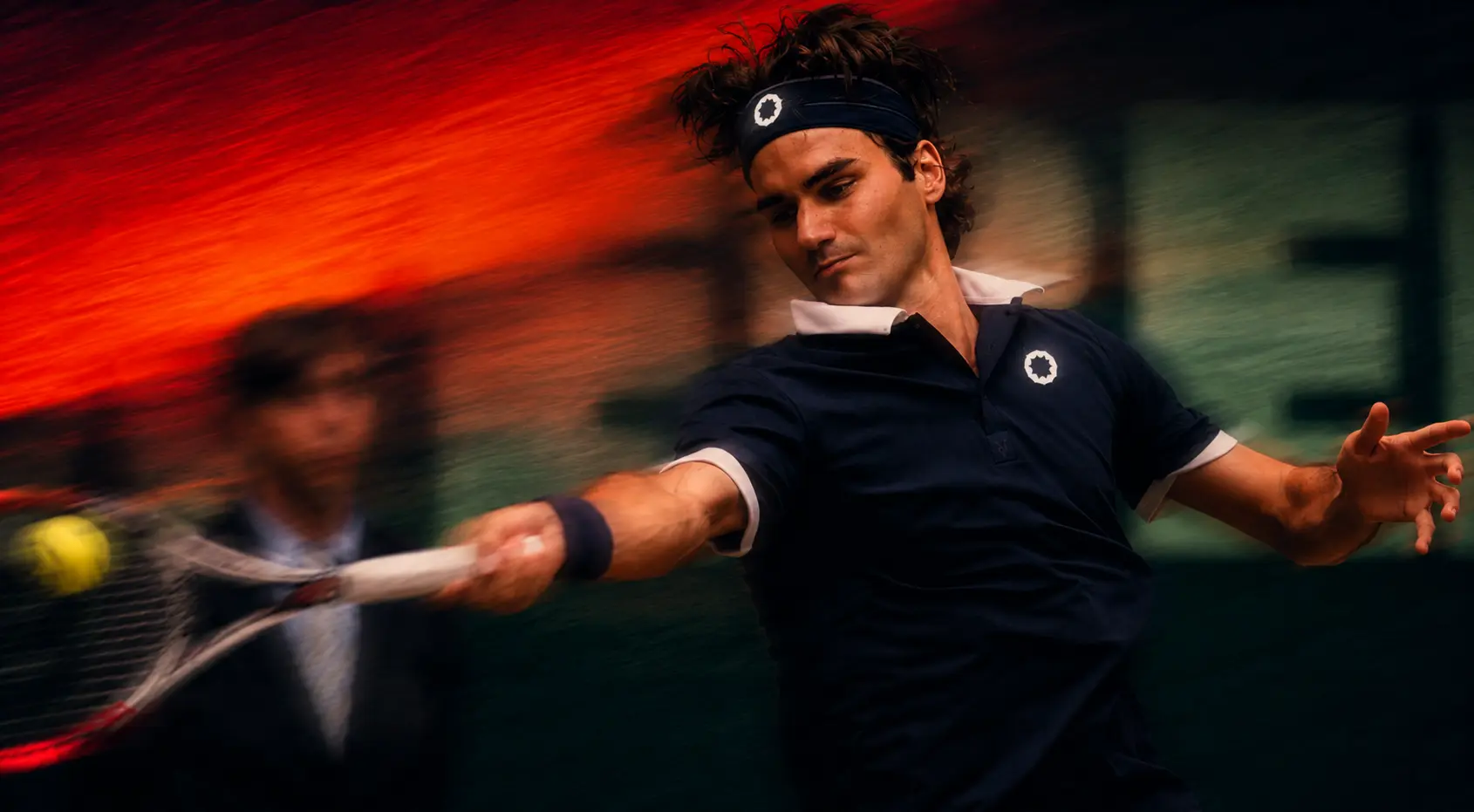
04 — Application
In the world
A strong system doesn't need to scream. It does its job. Across equipment and merch, Obsidian stays brutally consistent. Nothing unnecessary. Nothing decorative. Just a sharp identity carried through every touchpoint.


05 — Outcome
Built to last
The brief wasn't "make it look premium." Plenty of brands already do that. The goal was to make it feel like it belonged.
"Built in two weeks. Acting like it's owned the court the whole damn time."